Huge Watercolor Mixing Chart

Hello!
Today a bit of a different post!
For the longest time I had about 18 different colors in my watercolor palette, but over the last months I splurged on many more, bringing the count to 34. (actually 35 but hey, I forgot to add cobalt green to the mixing chart so well)
With that amount, I was starting to feel a bit overwhelmed in terms of color mixing. So I decided to spend a little over 2 days to make a proper color mixing chart. It was worth the effort, I found new neutrals and lovely color mixes but also understood why I gravitated towards certain pigments more than others. I also learned a lot about my paints and how they behave.
You can view me make it over on my youtube channel as well.
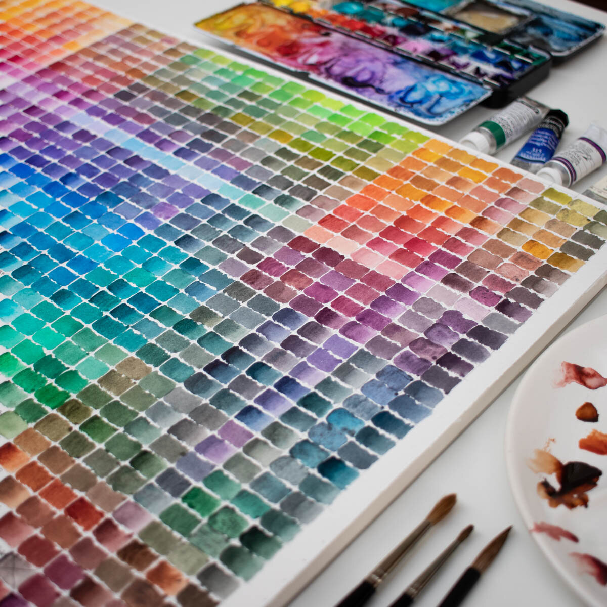
COLOR MIXING CHART
Basically, you start to draw a grid of x columns and x rows. X being the amount of watercolor you have in your palette.
Use the watercolor paper you normally use in your work (or the one you use most) in my case, I used the hot pressed semi-glazed, 100% cotton one from Clairefontaine.
Then you want to mix each color with every color you own following the grid. The ratio should be half to half.
However, I did sometimes push towards neutral when I saw that appearing in the mix or towards a color mixture I thought was beautiful.
This is a tool, so you do want to make useful mixes.
Usually color mixing charts are square, with the top triangle being full colors and the bottom triangle being watered down colors. I thought that was too much work so did make gradient in the top triangle.
WATERCOLOR SWATCHES
Sine I had an empty bottom triangle I went on and made color swatches, testing opacity, granulation, staining and dispersion.
Opacity: simply draw a thick waterproof black line and see if it can be covered by the paint. (usually it’s just a bit with watercolors)
Granulation: can be seen when doing a gradient
Staining: brush some water over the paint and dab a towel to see if you can lift of the paint. Note that hot pressed paper is not forgiving and won’t let you lift off much paint anyway.
Dispersion: brush some water on the paper, then add a dot of paint in the center to see how the paint spreads.
MY OWN COLOR CHART
Below my color chart, it might help you decide on pigments. I have a mixture of brands.
I bought most of my paints using the pigments guide from handprint.com.
I started with 12 pans from Schmincke and then added different pigments and brands to try. They’re all great. I do like the gooey consistency of M. Graham but like all these brands.
”Sch.” stands for Schmincke, “IS” is Isaro, W&N is “Winsor & Newton”, “Senn” is Sennelier, “M. Gr.” is M. Graham, I have one from Blockx and also four handmade colors from ArtsyOubliette.